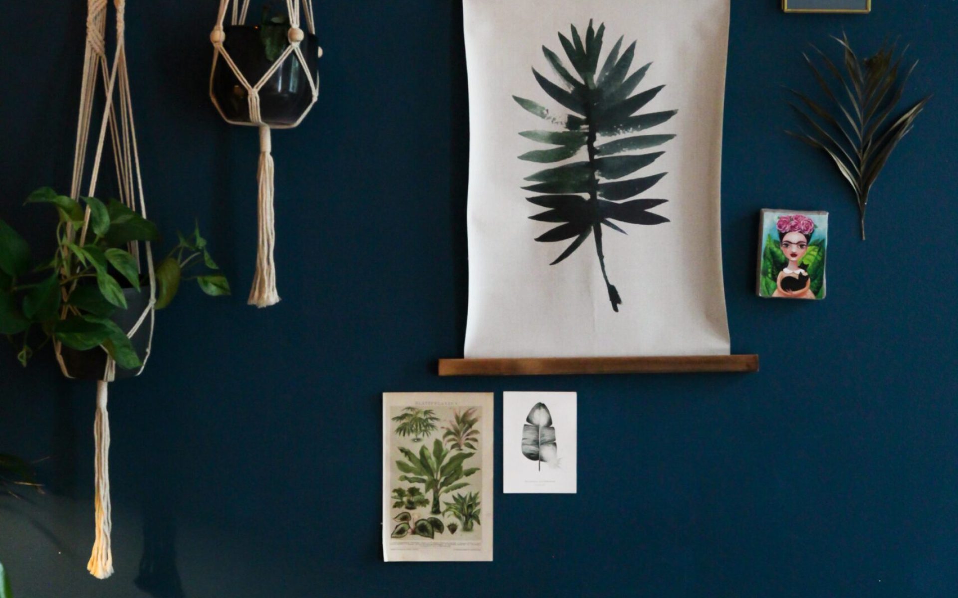
Hello, fellow advocates for mental health and well-being! Today, we’re exploring the important topic of color psychology and how it can impact emotion in healing spaces. As advocates for trauma-informed design, we know that creating spaces that promote relaxation and healing is essential for supporting individuals who have experienced trauma. So, let’s dive into the world of color psychology and learn how to choose the right hues for healing spaces.
- Choose calming colors: Calming colors like blue, green, and purple can promote relaxation and reduce anxiety. These colors are soothing and can help create a peaceful and healing atmosphere.
- Use warm colors for comfort: Warm colors like yellow, orange, and red can create a cozy and welcoming atmosphere. These colors are associated with comfort and can help promote feelings of warmth and security.
- Incorporate natural colors: Natural colors like earth tones and muted greens and blues can create a grounding and calming atmosphere. These colors are associated with the natural world and can help promote a sense of connection to the earth.
- Avoid overly bright colors: Overly bright colors like neon or highly saturated hues can be overstimulating and create a stressful environment. Choose muted, soft colors instead to promote a sense of calm and relaxation.
- Consider cultural associations: Different cultures may have different associations with colors. Consider the cultural background of the people who will be using the space and choose colors that are appropriate and respectful.
- Use color to define zones: Using different colors to define different zones in a healing space can help create a sense of organization and structure. For example, a meditation area could be defined by using calming blues or greens, while a play area could be defined by using warm yellows or oranges.
- Incorporate color therapy: Color therapy is an alternative healing practice that uses colors to promote emotional and physical healing. Incorporating color therapy into a healing space can provide additional benefits and promote a sense of relaxation and healing.
- Consult with experts: Consulting with experts, such as interior designers, psychologists, or art therapists, can provide valuable insight into choosing the right colors for healing spaces. These experts can offer unique perspectives and practical solutions to create truly supportive and healing environments.
- Conduct user research: Conducting user research, such as surveys or focus groups, can provide valuable insight into how different colors impact emotion in healing spaces. This research can help inform color choices and ensure that the space is truly supportive and healing for its users.
- Experiment with different color combinations: Finally, don’t be afraid to experiment with different color combinations to find the right hues for a healing space. Play with different shades and tones to create a soothing and supportive atmosphere that promotes relaxation and healing.
By implementing these principles of color psychology, we can create healing spaces that promote relaxation, mindfulness, and healing. Let’s continue to design with empathy, compassion, and a deep commitment to mental health and well-being. Thank you for joining us on this journey towards creating healing spaces that support and promote emotional and physical healing.

